With a myriad of platforms, mobile devices and screen sizes / resolutions to cater for, the modern web designer's job is rapidly becoming more complex dealing with visual layouts to compliment the range of viewing devices now available.
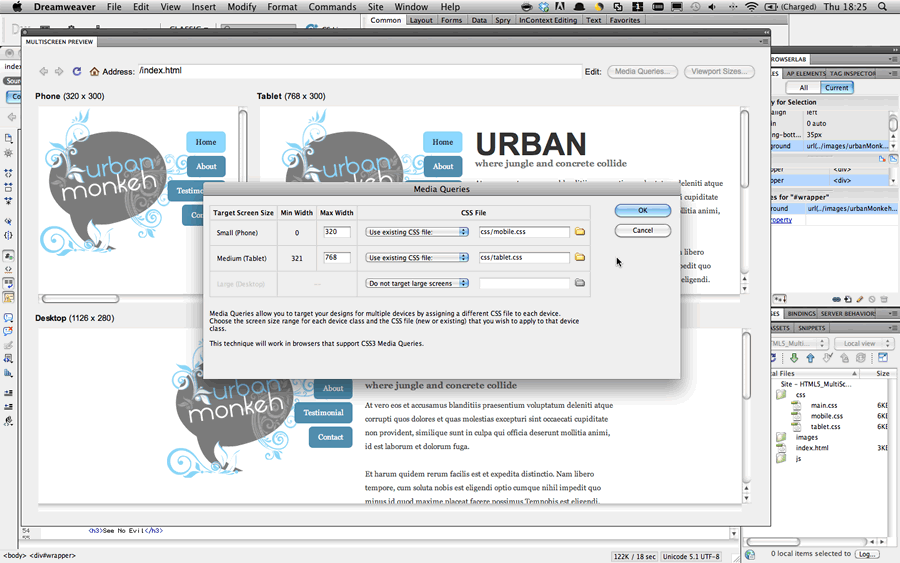
Adobe Dreamweaver CS5 update 11.0.3 included an additional tool (the HTML5 pack) to assist in HTML5 layouts and to help simplify / streamline the creation and management of designs to cover various screen sizes.
In the three-page tutorial featured in the April(182) issue of Web Designer magazine, I’ll guide the reader through creating a new project in Dreamweaver CS5 and using the Media Query window to view and manage multiple stylesheets to handle designs in various screen sizes and resolutions.
Issue number 182 of Web Designer magazine is out now, so make sure you grab a copy and see for yourself how Dreamweaver can assist you in designing for multiple screen sizes.


